
In 2018, our excitement levels knew no bounds as we completed 10 years of incorporation of — CIIE Initiatives. Through our publication, 10 years of innovation and experiments we wrote extensively about our journey over this decade — starting as an academic research centre, but evolving into multiple different directions; all aimed at fostering innovation in India — whether through pioneering accelerators, state-of-the-art incubation infra, riskiest catalytic capital, scale-up capital , or action-oriented insights. Over this last decade, conceptually and legally speaking, from being an academic ‘centre’ at IIMA, we have become a continuum of initiatives catalyzing India’s innovation landscape.
We have become The Innovation Continuum.
Innovate-On (or) Continue? Hmmmm!

The 10-year logo
While we had been thinking about brand identity, mid-2019 came as a disguised opportunity. It was time for us to discontinue our 10-year celebration logo. My colleagues Supriya Sharma, Niraj Mulani and Saman Arora Mekala were tasked with the job of re-imagining our identity for the next decade.
Honestly, for a moment, we even considered ‘re-naming’ ourselves for an unusual reason. A rather unique name of ours i.e. Centre for Innovation Incubation and Entrepreneurship (and its acronym CIIE) — despite being a tongue twister, long, and often confused with CII (Confederation of Indian Industries)- had somehow become too much of an inspiration for others. It had become a generic name for ‘innovation centres’ globally and on the last count, there were eight CIIEs across the world trying to ‘foster innovation’! [Dear Innovation Centres — innovation begins at home!]
And, in that direction, did we come up with novel names! You should have seen the names and the debates around them. Aren’t we a creative bunch?
Somehow, we resisted the temptation and instead decided to build upon our past brand equity, retain CIIE in our name and innovate a new avatar of the CIIE brand.
Among all the debates and disagreements, we were all clear about building a brand that truly represents us, the expanse of our initiatives and our ethos. We were determined to build a more prominent, bolder brand identity with a stronger recall.
Today, we are super stoked to unveil our new brand identity, and share with you some behind-the-scenes stories.
The Difficult Part: Letting go of the Past
While our past logo could have made people perceive us as an academic centre and even confused us with other CIIEs, we wanted to adopt an identity that represents who we are.
Consciously, we have decided to discontinue the use of ‘Centre for Innovation Incubation and Entrepreneurship’ in our name — and will restrict its usage for internal academic purposes at IIMA. Actually, the ‘Centre for Innovation Incubation and Entrepreneurship at IIM Ahmedabad’ was also not the most accurate description for us as most of our activities went far beyond the centre’s. Most of our activities have also not been just ‘at IIM Ahmedabad’ (I am sure you have met our folks in Bengaluru, Mumbai, Jaipur or Delhi).
The Obvious Part: Capturing the Past
Nonetheless, we wanted our brand and positioning to capture our past journey — and prominently reflect our name and history CIIE as well as our roots at IIMA. So, the first two elements of our new brand identity — “CIIE” and “Built at IIMA” — are a tribute to our exciting past.


The Creative Part: Building for the Future
We wanted our logo to truly represent not just who we are i.e. “CIIE” and “Built at IIMA”, but also what we stand for. We wanted our identity to carry a deeper meaning. We wanted our identity to have a soul. We are adding the soul through the following interventions -
a) The Innovation Continuum — We have adopted and trademarked ‘The Innovation Continuum’ as our new tag line. Going forward, the new avatar of CIIE will not be described as a ‘Centre for Innovation Incubation and Entrepreneurship’ but as ‘The Innovation Continuum’. This tag line may not necessarily appear in our logo — but will appear repeatedly across all our collaterals.
b) The CO Symbol — If not in words, we wanted the idea behind The Innovation Continuum to be reflected in our logo. After endless discussions, we narrowed down on ‘co’ from the ‘continuum’ to represent The Innovation Continuum.
Remember that I remarked on our creativity as little earlier. In the same creative fervour, we came up with a fresh symbol to represent The Innovation Continuum — we call it “the CO symbol”.

The CO Symbol
No, it’s not a Mobius strip — it is intentionally similar to the ‘infinity’ sign because our continuum does bring infinite opportunities for our entrepreneurs. It also brings infinite drive for us.
[On a connected note, as we considered the concept of CO more seriously, we started noticing the COs all around us. We soon collectively concurred that CO could stand for countless things — which are all core to our co-existence and conscience. A co-founder of one of our companies commented that CO represents our mission of ‘co-creating companies of consequence’, a collaborating organization correlated CO with them — our partners and a colleague conceived that CO also stood for co-operation — one of our core values. Over the last few days, we have been amazed by some of our followers sharing what ‘co’ stands for them!
The out-of-the-box thinker — Finally, we concluded that we must have the entrepreneur — the out-of-the-box thinker and our raison d’etre — represented in our logo as well. After some consideration, we picked up an element that we thought describes our entrepreneurs the best — an innovated visual of ‘out-of-the-box’.

Out-of-the-box
We are going to be using the bold black on white for our identity. Didn’t we tell you about our ‘bolder’ aspirations?
The Exciting Part: The New Identity
All the four elements of our logo came together beautifully. Our logo now truly represents who we are, our roots, our history, our ethos and our goals.


Just like the CO symbol, which had different meanings for different people, the logo brought forth diverse interpretations — all very relevant to us. One such interpretation was that working with out of box thinkers has increased the power of CIIE infinitely (image on the left) while another was that thinking out-of-the-box opens infinite possibilities for entrepreneurs (image on the right).

For the team, it primarily meant that we had found the new brand identity that truly represented who we stand for as an organization. A new identity that will represent us for times to come and inspire us to remain committed to being The Innovation Continuum for India.
Oh yes… we have a new name for us!
A part of our identity was solved with the coming together of the logo. However, we also needed to work on the “many CIIEs” and the CIIE/CII problem.
To integrate The Innovation Continuum in our brand name, we are going to call ourselves CIIE CO (read as “see-aai-aai-ee-co”; no, not as ‘psycho’!) in somewhat PepsiCo style. In text, we will be written as CIIE.CO — which has incidentally also been our web URL for a few years now.
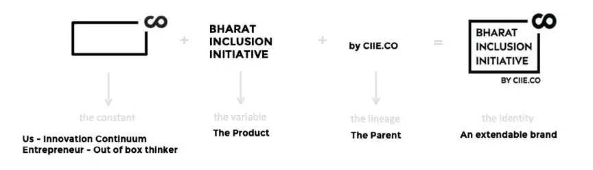
An Extendable Brand — By CIIE.CO
In the past, we had adopted a ‘house of brands’ strategy which gave us the freedom to create new brands (like iAccelerator, INFUSE Ventures, Bharat Inclusion Initiative, Bharat Innovation Fund and Innocity, among others). This approach had its own limitations; for one, they did not contribute to building the recall for our parent brand sufficiently, and vice versa.
With this fresh identity, we have aimed at building a brand language that meets the goals of building stronger brands for our initiatives as well as continually strengthening the CIIE.CO brand. In the words of a true-blue management grad, our brand language will have the advantages of both the ‘branded house’ and ‘house of brands’ strategies and allow our parent and daughter brands to operate more synergistically.
In a nutshell, we are super excited about our new name — CIIE.CO — and our new logo — its layered meaning, diverse interpretations, extendibility and application possibilities.
I am hoping the new logo will unleash the creativity and drive of the CIIE.CO team, entrepreneurs and our partners like never before. As CIIE.CO, we are determined to deliver value across THE INNOVATION CONTINUUM.
Onwards! Kunal